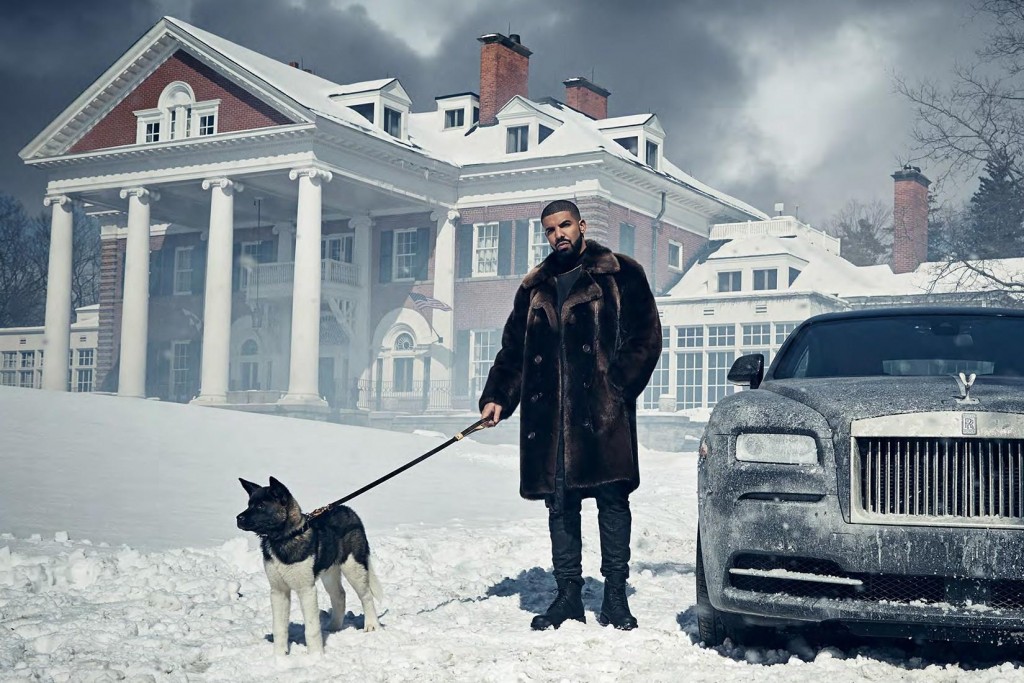
How to Create Products That Self-Promote (Drake’s marketing strategy)

Last Thursday, Toronto rapper Drake dropped his fifth studio album titled Views. Some people were surprised to hear projections of the album selling 2 million copies in its first week. Two million copies doesn’t seem like a stretch now — especially given all the free publicity the album is getting. If your social media feeds looked anything like mine over the weekend, you probably had a lot of #VIEWS to scroll through.
This isn’t the first time one of Drake’s album covers rallied the Internet to creating their own clever copies. In fact, it’s become sort of Drake’s thing. In 2013, when Drake released his third studio album Nothing Was the Same, the Internet lost it because the album’s cover looked like an amateur had designed it. And like anything poorly done on the Internet, the cover was quickly mocked. With some basic Photoshop skills, any of your witty friends could have at Drake.
On February 13, 2015 without any prior announcements, Drake dropped his mixtape If You’re Reading This It’s Too Late. What did the album cover look like? Think: Chick-fil-a How did the Internet respond? Even some of Drake’s music videos are crafted so that they can self-promote. Uproxx writes:
Flash forward to last Thursday and it’s no surprise that Drake’s highly anticipated fifth studio album has a cover that looks like it took about five minutes to make. Once the first few bad Photo-shopped #Views were shared on social media, Drake’s marketing team conveniently shared this link to a Drake Views creator. So even if you have no Photoshop skills whatsoever, you can still get in on the action. If you’re thinking… But, I’m Not Drake So How Can I Pull This Off in My Business? The reason why I’m showing you all these examples is not so you go out and design an ugly looking eBook cover or product package design. That’d be missing the point. The genius in Drake’s marketing strategy is the psychology behind it. We’ve talked a bit about the different types of content people like to share. One of those types is humor. Drake’s team knows what Drake’s target audience laughs at (Memes and bad Photoshop). And since Drake’s demographic is mostly millennials, who already have a distinct “snarky” sense of humor, you combine these factors and you’ve got yourself a recipe for a product that unwittingly self-promotes. The key is figuring out who your target audience is and what type of content best self represents them. Because at the end of the day, it’s all about them. Nobody is sharing a Drake Meme on Facebook because they think their friends will find it funny, they’re sharing a Drake Meme on Facebook because they want their friends to think they’re funny. Drake’s team knows this and they’re laughing all the way to the bank. Nick Papple |